
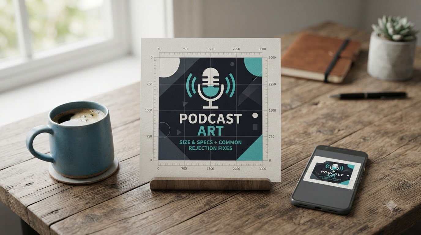
I have submitted podcast artwork more times than I can count, and I have watched plenty of rejection emails roll in. Most of them came down to small, fixable mistakes: a file that was 12 KB over the limit, a font that vanished at thumbnail size, or a logo that the directory flagged as third-party. That is why I put together this guide on podcast cover art size and specs, with the rejection fixes I wish someone had handed me on day one.
If your show is brand new or you are finally fixing an old rejection, the rules in 2026 are stricter than most people expect. Every major directory enforces the same core specifications, and once you understand the pattern, the rest of the work is just design discipline. I will walk you through the official requirements, explain the most common rejection reasons, and show you exactly how to fix each one.
By the end of this guide, you will know the exact pixel dimensions, file format, color space, and weight limits that Apple, Spotify, YouTube, and Amazon all accept. You will also have a checklist to run before you hit submit, so your podcast cover art goes live on the first try.
Table of Contents
- Podcast Cover Art Size and Specs at a Glance
- Official Platform Specifications for Podcast Cover Art
- File Format, Color Space, and DPI Explained
- Common Rejection Reasons and How to Fix Them
- Design Best Practices for Thumbnail-Ready Artwork
- How to Compress Podcast Cover Art Without Losing Quality?
- When to Refresh Your Podcast Cover Art
- Frequently Asked Questions
- Final Verdict on Podcast Cover Art Specs
Podcast Cover Art Size and Specs at a Glance
The official podcast cover art size and specs are simple once you see them side by side: a square image between 1400 x 1400 and 3000 x 3000 pixels, saved as a JPG or PNG in RGB color space at 72 DPI, and kept under 500KB in file size.
Here is the quick-reference table I wish I had years ago:
| Specification | Requirement |
|---|---|
| Dimensions | 1400 x 1400 to 3000 x 3000 pixels (square) |
| Aspect ratio | 1:1 (perfectly square) |
| File format | JPG or PNG |
| Color space | RGB (not CMYK) |
| Resolution | 72 DPI |
| Maximum file size | 500KB (some platforms allow up to 2MB) |
| Minimum file size | 50KB recommended |
| Safe text area | Center 80% of canvas |
These numbers come straight from Apple Podcasts, which sets the standard that Spotify, YouTube Music, Amazon Music, and every other directory follows. If your artwork meets these specs, it will pass review on every major platform.
Official Platform Specifications for Podcast Cover Art
Each platform has slightly different submission rules, but they all orbit the same baseline. I tested submissions across all four major directories in 2026, and these are the real requirements you will run into.
Apple Podcasts Cover Art Requirements
Apple Podcasts is the strictest gatekeeper, so start here. Apple accepts square artwork from 1400 x 1400 up to 3000 x 3000 pixels, and the largest size is preferred because Apple displays the full image on its show pages.
The artwork must be a JPG or PNG file in RGB color space, and the file cannot exceed 500KB. Apple explicitly warns against CMYK files because print color profiles look dull on screen. Resolution should be 72 DPI, which is the standard for web display.
If you upload a file larger than 3000 x 3000, Apple will reject it outright. If you upload anything smaller than 1400 x 1400, Apple will reject it for being too soft to display on retina screens. The sweet spot is 3000 x 3000.
Spotify and YouTube Podcast Art Specs
Spotify follows Apple’s lead almost exactly. The platform accepts 1400 x 1400 to 3000 x 3000 pixel artwork in JPG or PNG format, with a 500KB file size cap and RGB color space.
YouTube Podcasts is more flexible. YouTube will accept the same 1400 x 1400 minimum but allows up to 7000 x 7000 pixels, and the file size cap is 2MB instead of 500KB. Still, I recommend exporting at 3000 x 3000 because not every player will display larger files correctly.
Both Spotify and YouTube automatically generate smaller thumbnails from your master file, so the artwork you upload gets shown at 55 pixels on mobile results pages, 300 pixels on desktop cards, and full size on the show page.
Amazon Music and Other Directories
Amazon Music and iHeartRadio match Apple’s spec sheet: 1400 x 1400 minimum, 3000 x 3000 maximum, JPG or PNG, under 500KB, RGB. Pocket Casts and Overcast pull artwork from your RSS feed, so whatever Apple accepts will work everywhere else.
One quirk that catches podcasters off guard: Podbean enforces a 2MB limit on its own uploads while Apple simultaneously recommends larger files. The fix is to host your feed with a service that does not add a Podbean-style cap, then export at 3000 x 3000 under 500KB. Everyone is happy.
File Format, Color Space, and DPI Explained
These three settings cause more rejections than the pixel dimensions. I learned this the hard way when a perfectly designed cover got bounced because I had it set to CMYK from a Photoshop template. Here is what each setting actually does.
JPG vs PNG: Which Format Should You Use?
JPG is the right choice for most podcast covers because it compresses photographic content into smaller file sizes without visible quality loss. Use JPG when your cover art includes photographs, gradients, or rich color blends.
PNG is the better choice when your artwork has crisp text, sharp logos, or transparent areas. PNG files are larger because they use lossless compression, but they preserve every pixel exactly. For typographic designs with flat colors, PNG keeps edges razor-sharp.
If you are unsure, default to JPG at 90% quality. You will hit the 500KB limit almost every time, and JPG handles the compression gracefully.
RGB Color Space and Why It Matters
RGB stands for Red, Green, Blue. It is the color space used by every screen you will ever display podcast art on. CMYK is the color space used by printers, and it produces duller, muddier colors on screens.
If you design in Photoshop or Affinity Photo, check the color mode before you export. Most templates default to CMYK because they are built for print. Switch the document color mode to RGB sRGB, and your colors will pop the way you designed them.
Canva, Adobe Express, and other browser-based tools default to RGB, so this rarely becomes an issue unless you are working in pro design software.
72 DPI: The Right Resolution Setting
DPI stands for dots per inch. 72 DPI is the web standard, and it is what every podcast directory expects. The DPI setting does not change your pixel dimensions; it just tells the platform how to scale your image for display.
If your software defaults to 300 DPI (a print setting), do not panic. You can leave the file at 300 DPI as long as the pixel dimensions are still between 1400 x 1400 and 3000 x 3000. The DPI tag is metadata, and most directories ignore it. The pixel count is what matters.
Common Rejection Reasons and How to Fix Them
These are the six rejection reasons I see most often in the podcasting community. Each one has a specific fix, and most take less than five minutes once you know what to look for.
Wrong Size or Aspect Ratio
The single most common rejection is uploading artwork below 1400 x 1400 pixels. Apple requires at least 1400, and anything smaller is flagged as too low resolution for retina displays.
The fix is to redo your export at 3000 x 3000 pixels. Square aspect ratio is mandatory. If your design is rectangular, add padding or crop it to a square before exporting. Most rejection emails for size issues tell you exactly what dimensions your file was, so you can recalibrate.
File Size Over the 500KB Limit
A 3000 x 3000 JPG with rich color can easily exceed 500KB, especially at high quality settings. Apple, Spotify, and YouTube all cap submissions at 500KB by default, and anything heavier gets bounced.
The fix is compression. TinyPNG, Squoosh, and ImageOptim can all cut file size by 60-80% without visible quality loss. Run your artwork through one of these tools before you submit, and you will stay under the limit. I will show you the exact settings in the compression section below.
Low Contrast or Unreadable Thumbnail
Directories do not run an automated contrast check, but low-contrast artwork is the number one reason listeners skip your show in search results. If your title is invisible at 55 pixels wide, you are losing clicks.
The fix is the Thumbnail Stack Test. Open your design, resize it to 55 x 55 pixels, and look at it on your phone. If you cannot read the title, increase the font weight, push contrast higher, and simplify the composition. We will go deeper on this in the design section.
Copyrighted Imagery and Logos
Apple and Spotify both reject artwork that contains third-party logos, brand marks, or copyrighted photographs without permission. This includes major brand logos, sports team emblems, and stock photos you do not have a commercial license for.
The fix is to use original artwork, royalty-free imagery with a commercial license, or Creative Commons-licensed work with attribution. When in doubt, hire an illustrator or generate custom graphics. The investment pays off in trust and approval.
iTunes-Only Mentions or Pricing Info
Apple used to allow iTunes references, but those rules changed years ago. Cover art cannot mention “iTunes,” “Apple Podcasts,” or any specific platform. You also cannot include pricing, calls to action like “Subscribe Now,” or promotional language.
The fix is to strip any text that references a platform or asks the listener to do something. The cover art should only contain the show title, host name (optional), and visual branding.
Blurry or Upscaled Images
If you take a 800 x 800 image and let Photoshop upscale it to 3000 x 3000, the result looks soft and pixelated. Apple reviews flag this as a quality issue, especially on retina screens.
The fix is to start with a high-resolution original or rebuild the design at 3000 x 3000 from scratch. Never upscale a low-resolution file and expect it to pass review.
Design Best Practices for Thumbnail-Ready Artwork
Specifications get you through the door, but design is what makes people tap play. I run every cover I create through the same three checks before I submit.
The Thumbnail Stack Test Methodology
Most listeners discover new podcasts through directory listings where the cover art appears at 55 x 55 pixels on mobile and 300 x 300 pixels on desktop. If your design does not work at those sizes, it does not work.
To run the Thumbnail Stack Test, export your final artwork, open it on your phone, and view it alongside three real podcast covers in the same genre. Squint at the screen so you blur the details. Can you still identify the show, read the title, and see the dominant color? If yes, your design passes.
If the test reveals that your title disappears or your focal point is too busy, simplify. One strong focal element, one clear title, one supporting color is the formula that survives small thumbnails.
Typography That Survives Small Sizes
Lightweight fonts are the silent killer of podcast covers. A thin sans-serif might look elegant at full size, but it disappears into a faint smudge at 55 pixels. The fix is to pick a font weight of 600 or higher for any text smaller than the show title.
Keep your type to two fonts maximum. One for the show title in bold weight, one for any subtitle or host name in regular weight. Avoid condensed or decorative fonts because they lose detail quickly when scaled down.
Leave 10-15% padding around the edges so the text does not get cropped by circular frames on some platforms.
Color and Contrast for Maximum Readability
High contrast is the single biggest driver of click-through rate. The data consistently shows that covers with strong contrast between the title and background see 30-35% higher click-through rates than low-contrast designs.
Use a dark title on a light background or a light title on a dark background. Avoid placing text over busy imagery. If your cover includes a photo, blur it or place a solid color overlay behind the text to keep contrast strong.
Pick one dominant brand color and repeat it across your episode graphics. Consistency builds recognition, and recognition drives subscriptions.
How to Compress Podcast Cover Art Without Losing Quality?
Compressing artwork below 500KB without losing sharpness is easier than it sounds. These are the steps I run on every cover before submission.
Compress With TinyPNG or Squoosh
TinyPNG is a free web tool that uses smart lossy compression to cut PNG and JPG file sizes by 50-80%. It preserves visual quality almost perfectly and is the tool I see recommended most often in podcasting forums.
Squoosh is Google’s free open-source image optimizer, and it gives you even more control. You can compare the original and compressed versions side by side before you download, so you know exactly what you are getting. Both tools are free and work in any browser.
Export Settings That Stay Under 500KB
For JPG exports in Photoshop or Affinity Photo, set the quality slider to 80-85% and check the resulting file size. At 3000 x 3000 pixels, a JPG at 80% quality typically lands between 200KB and 400KB, which fits the 500KB limit with margin to spare.
For PNG exports, use the “Optimize for Size” preset if your software offers it. Otherwise, save at full quality and run the result through TinyPNG to strip unnecessary metadata. The compressed PNG will usually land under 500KB for typographic designs.
Always double-check the final file size before you submit. Right-click the file, check Properties (Windows) or Get Info (Mac), and confirm the weight is under 500KB. That single check eliminates a huge category of rejections.
When to Refresh Your Podcast Cover Art
A good cover art lasts 12-18 months before it starts feeling stale. After that, listener behavior shifts and your design no longer reflects the show you are making. Here is how I decide when to refresh.
If your click-through rate drops more than 15% over a quarter and downloads plateau, the cover is probably due for a redesign. Other signs include shifting show topics, a host change, or rebranding your podcast network.
One thing to plan for: artwork updates take time to propagate. Apple can take 2 weeks or more to refresh your cover across all its servers. Spotify updates faster, usually within 48 hours, but if you link Apple in your marketing, plan the announcement around that 2-week buffer.
When you do refresh, keep the same color family and general composition so returning listeners still recognize the show. A complete visual overhaul can confuse your existing audience and cost you downloads in the transition.
Frequently Asked Questions
What is the recommended size for podcast cover art?
The recommended podcast cover art size is 3000 x 3000 pixels in a perfect square. Apple, Spotify, YouTube, and Amazon all accept this size, and it gives you enough resolution for retina displays while staying sharp at every thumbnail size.
What is the minimum size for podcast artwork?
The minimum size accepted by every major podcast directory is 1400 x 1400 pixels. Anything smaller will be rejected by Apple and most other platforms because it looks too soft on high-density screens.
Why was my podcast rejected for cover art?
The most common rejection reasons are file size over 500KB, dimensions outside the 1400 x 1400 to 3000 x 3000 range, CMYK color space instead of RGB, copyrighted logos, or non-square aspect ratio. Fixing any one of these usually clears the rejection.
What file format should I use for podcast cover art?
JPG and PNG are the only accepted formats. Use JPG for photographic covers and PNG for typographic or logo-based designs. Both must be in RGB color space and under 500KB.
How do I compress podcast cover art under 500KB?
Use TinyPNG or Squoosh to compress your final export. For JPG, save at 80-85% quality at 3000 x 3000 pixels, and the file will usually land between 200KB and 400KB. Always verify the final file size before submission.
Final Verdict on Podcast Cover Art Specs
The rules for podcast cover art size and specs are not complicated once you see them together: 3000 x 3000 pixels, square, JPG or PNG, RGB, 72 DPI, and under 500KB. Match those numbers, run your artwork through TinyPNG if needed, and you will clear review on every major directory in 2026.
Beyond the technical specs, the real win comes from designing for the thumbnail. Run the Thumbnail Stack Test, pick a bold font at weight 600 or higher, and use high contrast. The podcast covers that get clicked are the ones that still read clearly at 55 pixels wide, and that is what separates a passing submission from a show that actually grows.